I come from the world of architecture. Not the one where architects design software but the one where they design buildings - real ones with foundations, a structure, walls and a roof. And although that is now part of my past, it is still present in my daily life, because - believe it or not - the design of apps and buildings have so much in common.
Let’s start with the basics of UI and UX to see how they are analogous to architecture.
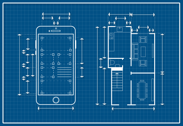
We can define the User Interface (UI) as a hierarchy of screens, pages, and visual elements that are used to interact with an app. They are the space and primary method that a user navigates around. In architecture this equates to a floor plan: the distribution of spaces, rooms, corridors, windows, and stairs that people navigate inside a building.
Further, we can compare them by individual elements.
“Sign In” and “Sign Out” actions are like the front door of an application, with passwords as the keys. Action buttons are comparable to the doors and corridors that move us between screens or rooms. Navigation bars connect users with different levels of the app, like stairs or lifts in a building, that allow you to change floors.
Even the interior design of a building, the use of space, signage and colours, have good analogies to the aesthetic elements of an app such as the iconography, typography, and colour palette.
The international standard on ergonomics of human system interaction, ISO 9241-210 defines user experience (UX) as "a person's perceptions and responses that result from the use or anticipated use of a product, system or service". This includes all of the users' emotions, beliefs, preferences, perceptions, physical and psychological responses, behaviors and accomplishments that occur before, during and after use.
In order to ensure that an application has an appropriate UX, we start with good research.
What is the context within which we have to work? What will the application be used for? Who is going to use it, and how? Which are the necessary features and how do we propose to implement them? What problem are we trying to solve for the user?
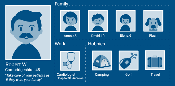
The creation of effective personas, based on real user data, provides us with the information that we need to help us make appropriate decisions as we design an application.

This qualitative and quantitative research is also used in the architectural design of spaces.
Is the house for a single person, or a family with three kids and a dog? Does this building need to allow large numbers of people to flow easily through it? Is security an important aspect? What working styles will be employed in this commercial building?
Each of these mean that you will make different design decisions, considering individual and collective needs.
The user of the space is the key that both architect and app designer have to have in mind during each step of the design process.
Let’s go a bit further and consider dimensions. Each platform (and a lot of designers) have their own rules and patterns concerning such things as a button’s minimum tappable area, ideal font size, or element spacing, in order to help the user interact with the app more effectively. In the same way an architect employs established rules and patterns concerning, for example, the right size of a parking place. Get this wrong and the result will be a scratched and beat up car, and an unhappy user.
The solution obviously isn’t to make everything bigger. A toilet the size of a living room doesn’t work, and neither does a secondary button twice the size of a screen’s primary action button. In architecture, by law, plots often have a maximum space they can build in, or there are planning restrictions that govern how the space has to be used, depending on the type of land. The same principle here can apply to certain types of app; for example to meet Apple’s “Made for Kids” restriction, apps have to ensure that they do not allow browser access without some form of parental control.
All that being said, designing an app does have certain advantages over designing a building.
For example, designing an icon. In essence, all you have to do is check that all of the dimensions are whole numbers while you are drawing. Most of the programs we use now as part of the design process are aware of this necessity and provide tools that help you to do this work. Amazing. You export the icon in the sizes the engineer needs and the work is done.
It’s not quite so simple in architecture! The problems are not usually found at design time (except when you have a particularly painful client - usually your family), they appear when you send the plans to the builder.
You arrive on site to see what is being built and you find that the builder, in order to reduce their costs, has made changes to the materials so the walls are thinner than you have designed. Or the opposite - the walls are thicker because he has changed the position of the service ducting and they take more space than you were expecting. Or perhaps the brand of windows that the architect has specified are too difficult to source and the builder has given up and swapped them for windows with different dimensions… sigh.

These are only two examples - both from on my own experience! - that show how the final dimensions of the space can be affected. The architect’s job is to always be alert that changes being made don’t adversely affect the user experience. I think I have had more confrontations with builders and labourers than with software engineers - maybe this is significant!
What about usability? In architecture it makes no sense for a user to have to go up five flights of stairs when they need to go to the toilet, and in app design it makes no sense for a user to have to travel through too many screens to get to where they want to go - especially if it’s a function that has to be used frequently!
Users need to understand the structure of the app instinctively, just like they need to understand the structure of a building. They should know how to enter and exit (unless we’re talking about a prison…), and how to move between spaces.
In the same way this ensures you don’t feel lost in a building, we need to ensure that the same feeling of safety and natural movement is applied in the design of an app. If they find it hard to move around and get to where they want to go, they won’t use it.
Of course, let’s not forget all of the regulations around aspects such as fire safety, electrical safety, security and so on. There are many thousands of them in architecture - even forgetting country-specific regulations - but in apps you only have to worry about the rules as they apply to the operating system you develop for, usually iOS, Android and Windows. And they have far less regulations!
It’s also worth considering frequency of use in architecture and app design.
Building a house - something that you use continually, for many years - could be similar to creating a social media or journal app. A school could equate to fitness or diet apps, something that you use for a defined period of time, and perhaps only at certain times of the week. A hotel translates as a city guide app - something that you use once and delete when you’re finished. A utility or administration app is like a hospital, where functionality can and should triumph over aesthetics. A fantasy game-app could be a type of organic or whimsical architecture with natural forms where the limitations aren’t obvious from just looking at the outside.
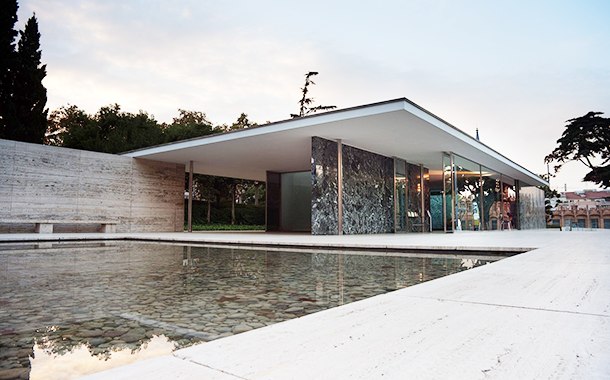
Regarding style, surely both designers and architects have much to learn from minimalist architecture, such as Mies Van der Rohe and his “less is more” approach, where it predominates the essence, purity and unity of the elements. Wouldn’t it be great to find more apps like this? No repetition of actions, no overloaded screens of information, a flow that’s easily understood by users… these design choices are now in your (and my) hands.
 The Barcelona Pavillion by Ludwig Mies van der Rohe. Original photo by Ashley Pomeroy.
